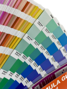
What is Pantone
Pantone Color System (PMS)
The Pantone Color System (PMS) is an international standard for accurately defining colors in the printing and design industries. This system was created to ensure that a specific shade can be consistently reproduced across various printing methods and materials. Pantone is especially useful for businesses that want to present their brand and message in printed materials uniformly.
Beyond Pantone: RGB and CMYK – What’s the Difference?
Before diving deeper into the Pantone system, let’s touch on two other significant color spaces – RGB and CMYK. While Pantone is a highly effective way to ensure that corporate gifts and printed materials reflect the exact shades defined in a brand book, RGB and CMYK are also critical for those involved in design and printing. However, Pantone provides greater precision for maintaining consistent corporate colors.
RGB (Red, Green, Blue)
RGB is a color space based on three primary colors – Red, Green, and Blue. It is the standard for the digital world and is used for displays such as computer monitors or smartphones. By combining these three primary colors, millions of shades can be created. As such, RGB colors are primarily used in web design and digital media.
CMYK (Cyan, Magenta, Yellow, Key/Black)
CMYK is a color space based on four colors: Cyan, Magenta, Yellow, and Key/Black. It is the standard in the printing industry because it reflects printers’ process of creating different colors on printed pages. CMYK Colors develops brochures, posters, and other print materials.
What is the Pantone Color System?

PMS comprises many colors, each identified by a unique numeric code. For instance, a shade of Pantone blue may be designated as PMS 6122C. Each color is defined by a specific mixture of pigments, ensuring accurate and consistent reproduction across all printing methods. This means that if a company’s logo features a particular PMS color, it can be precisely replicated on any print medium, whether a label, business card, or promotional material.
Why is Pantone Important?
Pantone helps maintain a consistent and uniform appearance for your brand colors, crucial for brand recognition and identity. If you want your corporate gifts to align perfectly with your brand colors, PMS is your best tool.
Recommendations
- If your company has a unified brand color system, use it when producing gifts and other materials.
- If you’re unsure which Pantone color fits your brand, consult a professional designer or printing expert.
- Keep your Pantone color codes securely stored for easy reference when ordering branded items.
Conclusion
The Pantone Color System is essential for businesses to ensure a consistent brand appearance. If you’re interested in designing corporate gifts for your company, contact us to learn more about incorporating Pantone colors.
Printing technology is a fascinating and contemporary field of study. For further information, you might consider exploring the adding logo page.
Find more about Pantone standards and history from www.pantone.com website.


